In April of 2023, I organized a two-week online entrepreneurs forum for ladies to interact and learn how to upscale their businesses. It was a huge success and I go so many positive reviews and commendations from the 35-plus ladies that participated in the forum.
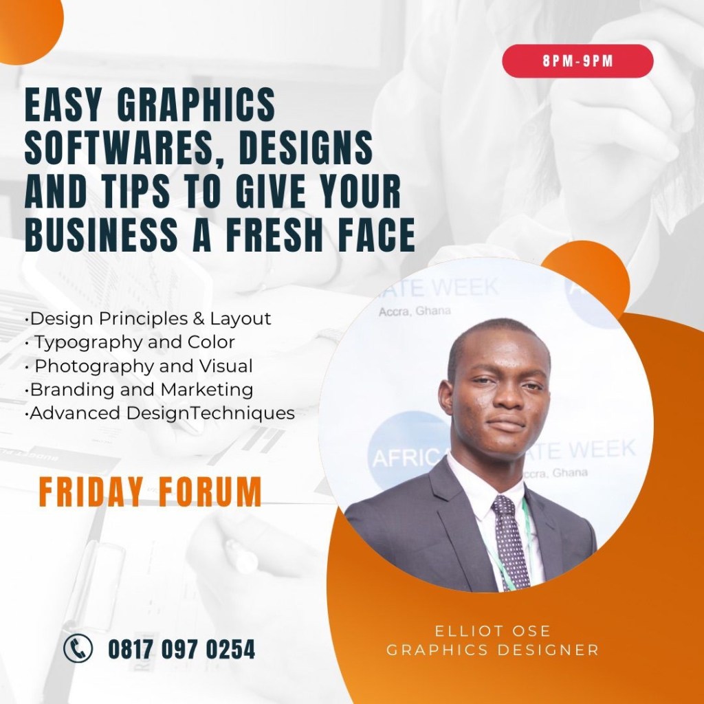
On one of such days in the two weeks, I had my cousin, Mr Elliot Ose, who is a professional graphics designer give a lecture on easy ways to scale up the graphics for your business and he delivered a highly informative presentation on some graphic tips to give your brand an identity, create flyers and he also talked on how to use the famous graphics design app – Canva to create easy yet catchy designs. I have transformed his lecture into an article as it contains practical guidance you can adopt in creating incredible designs for your business. I re-phrased the lecture where needed and for other parts, it’s as exact as he said or typed it. Without further ado, let’s dive in.
Designing Flyers.
First let’s talk about what makes a good design, especially in reference to Flyers and Posters for your business. A good flyer design is visually appealing, easy to read and understand, and effectively communicates the intended message. There are some important factors to consider when designing a flyer.
• Clear and concise message: Your message should be brief, clear, and easy to understand. Use headlines, subheadings, and bullet points to break up the text and make it more readable.
• Eye-catching visuals: Use high-quality images, graphics, and colours to grab the reader’s attention and create a visually appealing design.
• Proper use of white space: Don’t overcrowd your flyer with too much information or design elements. Use white space to create balance and give your design room to breathe.
You might be wondering, what is white space?
White space, also known as negative space, is the area of a design that is left empty or unmarked. It doesn’t necessarily have to be white, but it’s called “white” space because it’s often left blank in a design, giving the impression of white or empty space.
White space can be used to create balance, contrast, and clarity in a design. It helps to organize and separate elements, making the design easier to read and understand.
White space can also create a sense of elegance, simplicity, and sophistication in a design. It can give the design a more minimalist feel and draw the viewer’s attention to the most important parts of the design. When used effectively, white space can greatly enhance the overall aesthetic and effectiveness of a design.
• Consistent branding: Use the same colour scheme, fonts, and design elements as your other marketing materials to maintain consistency and reinforce your brand identity. Usually, the colours and fonts you use are your brand colours and fonts. Whether it’s the colour & font used in your logo or a colour and font you specifically use for your graphics, it must remain consistent. You don’t use red today and then use lavender tomorrow, and then use green after that. It makes the branding chaotic, which is something you’d want to avoid, except that’s what you’re going for, then you’re on track.
• Call to action: Include a clear call to action that tells the reader what you want them to do, whether it’s visiting your website, attending an event, or making a purchase.
• Target audience: Consider the audience you are trying to reach and tailor your design to their interests and preferences.
• Readability: Use a legible font size and typeface that is easy to read from a distance. I’m a designer and my favourite fonts to use for the body of texts are Montserrat and Poppins. They are very legible and they look good.
By considering these factors, you can create a visually appealing flyer, communicates your message effectively, and encourages your target audience to take action.
Canva: The Modern Graphic Design Application.
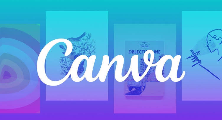
Canva is a popular graphic design platform that allows users to create a wide range of visual content, including social media graphics, posters, flyers, presentations, and more. Some key features of the Canva app include:
Templates: Canva offers a wide variety of customizable templates for various design types, including social media posts, marketing materials, and personal projects.
Design elements: The app provides a library of design elements, including icons, images, shapes, and text options. Users can upload their images and logos as well.
Editing tools: Canva offers various editing tools, such as filters, cropping, resizing, and transparency adjustments. Users can also adjust the color, font, and layout of their designs.
Collaboration: Canva allows multiple users to work on a design project together and share access to the same files.
Publishing and sharing: Once a design is completed, users can download it in various file formats or share it directly on social media platforms or via email.
Fonts in Graphics Designing
There are many different types of fonts, each with their unique style and characteristics. I’d give a list of some type of fonts.
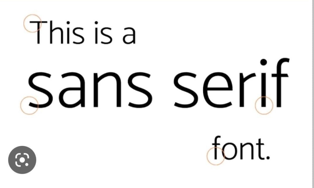
Sans-serif fonts: Sans-serif fonts do not have serifs at the ends of their strokes. Examples of sans-serif fonts include Arial, Helvetica, and Verdana. Sans-serif fonts are often used for digital designs and web-based materials because they are considered more modern and legible on screens.
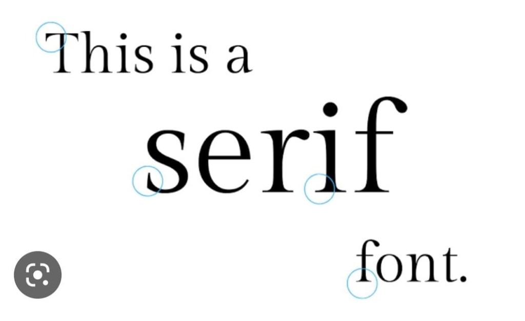
Serif fonts: These fonts have small lines, or serifs, at the ends of the strokes that make up each letter. Examples of serif fonts include Times New Roman, Georgia, and Baskerville. Serif fonts are often used for print materials such as books, newspapers, and magazines because they are considered more traditional and legible.
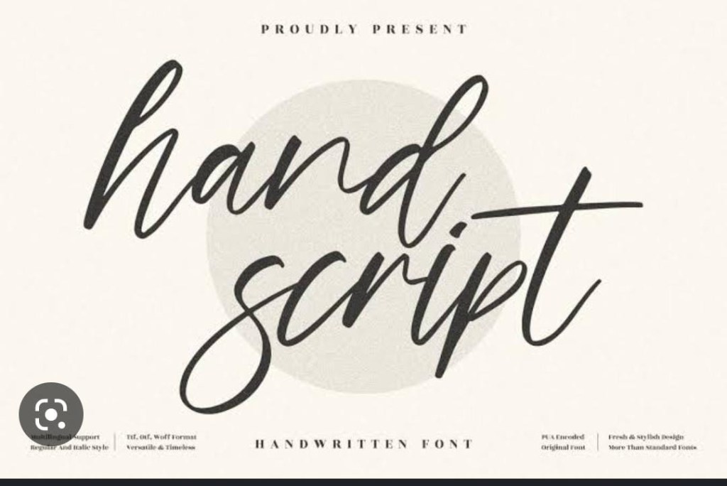
Script fonts: These fonts mimic handwriting and cursive script. Examples of script fonts include Brush Script, Edwardian Script, and Monotype Corsiva. Script fonts are often used for formal and elegant designs such as invitations, greeting cards, and wedding stationery.
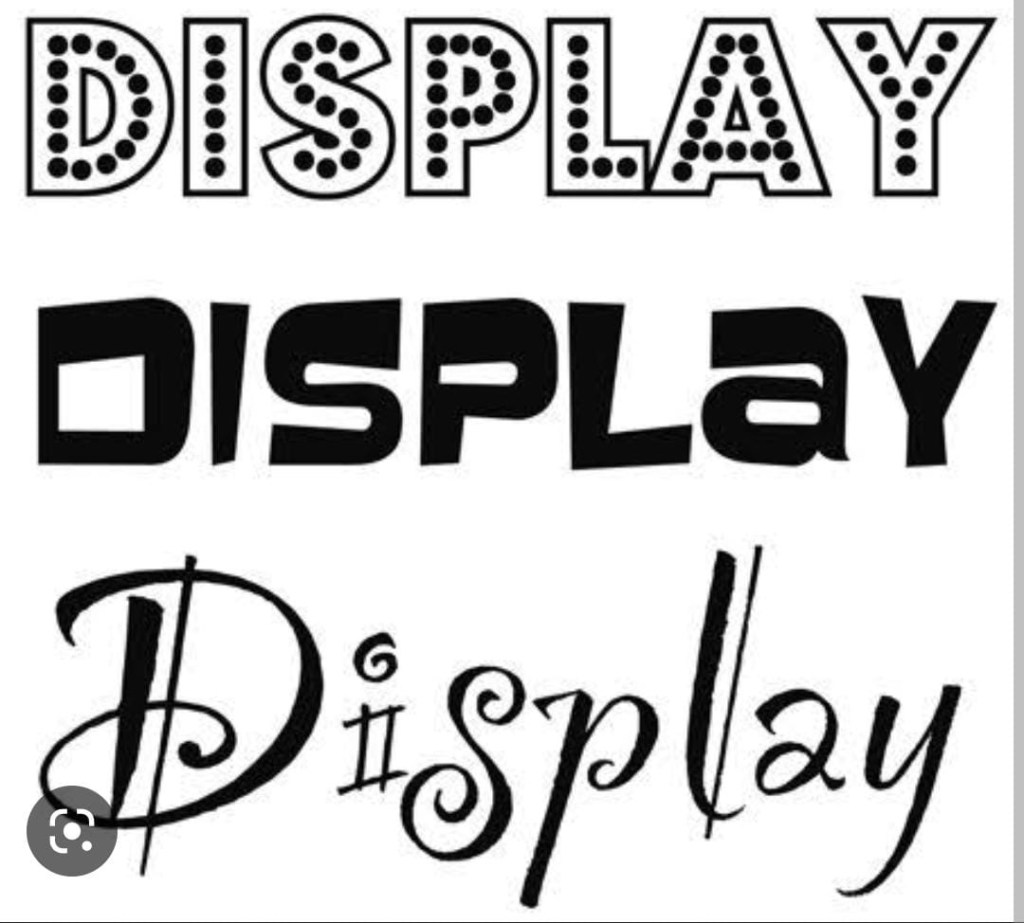
Display fonts: These fonts are highly stylized and are designed to be used in larger sizes. Examples of display fonts include Blackletter, Old English, and Impact. Display fonts are often used for headlines, logos, and other design elements that need to stand out and grab attention.
These are the 4 main types of fonts and each of them have a certain vibe they give a design. A serif font would be very fitting in a high-end fashion poster or magazine, but it would look out of place in a children’s flyer. The same applies to the others.
So basically, when you piece all these things together, you should get a proper flyer that should enthral your target audience.
I hope you found this article as helpful as the lecture was to me and the ladies that participated in my entrepreneurs forum. Mr. Elliot Ose designs graphics professionally and you can find him on Instagram @elliothelix. Thank you for reading ❤️

Thank you so much for this post.
I love the detail🥰. This is a must read for all business owners looking to promote their business using the right graphics to grasp the attention of the right audience.
LikeLiked by 1 person
Thanks for your comment and I’m glad it was helpful for you ❤️
LikeLike