In the world of clothes, colors are like storytellers. They help show off our style and how we feel, without saying anything. Think about walking into a room full of bright reds or calm blues – it’s like the clothes are talking! Colors in fashion aren’t just for looks; they’re like a special language. In this article, we’ll talk about how colors in our clothes tell a cool story.
Throughout fashion history, colors have been like fashion’s time machine. In the old days, people used natural stuff like plants and bugs to dye their clothes. Royals wore rich, deep colors because those dyes were expensive. Later on, colorful fabrics became a big deal in fashion. The swinging ’60s, for example, were all about bold, bright colors. Each era had its color vibe, telling a story about what was cool or important at the time. Today, colors still carry history and meaning in the fashion world, speaking volumes about our past and present style choices.
Primary and Secondary Colors
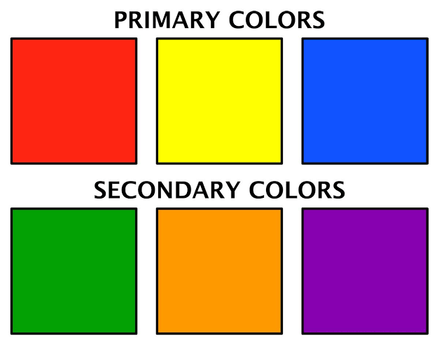
Primary colors are like the superhero colors: red, blue, and yellow. They’re special because you can’t mix other colors to get them. When these primary colors hang out, they create all the other colors we see!
Secondary colors are like the sidekick colors, made by mixing primary colors. When red and yellow team up, they make orange. Blue and yellow join forces to create green. Red and blue combine to form purple. So, secondary colors are born when primary colors buddy up!
Colors and Fashion Designing
In fashion designing and sewing, color is like the magic wand that brings clothes to life. Designers pick colors to tell a story or set a mood. It’s not just about what looks pretty – each color has a vibe. Sewing together different colors is like creating a visual melody; the right combo can make an outfit sing! Color also helps highlight details, shaping how people see and feel about a piece of clothing. So, in the world of fashion, choosing and sewing with color is like painting a canvas with threads and fabric.
When diving into the colorful world of fashion designing, here are some key rules to keep in mind:
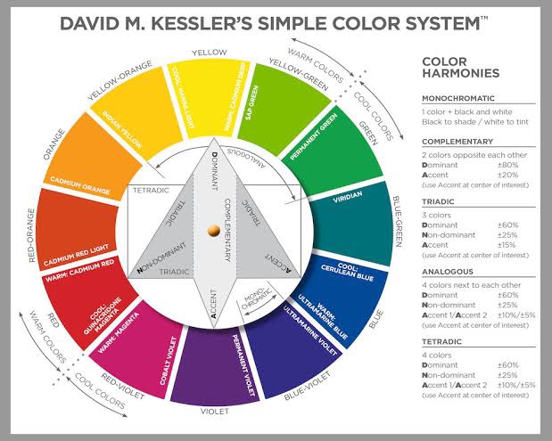
- Color Wheel Wisdom: Understand the color wheel – complementary colors (opposites on the wheel) can create a bold contrast, while analogous colors (next to each other) offer a harmonious feel.
- Balance is Key: Mix bold colors with neutrals for balance. Too much of one can be overwhelming, so striking a balance keeps things visually interesting.
- Consider the Season: Think about the season you’re designing for. Light and bright colors often suit spring and summer, while deeper tones work well in fall and winter.
- Fabric Texture Matters: Different fabrics absorb and reflect color differently. Satin might make colors look more vibrant, while matte fabrics can soften them.
- Know Your Audience: Consider who will wear your designs. Age, cultural preferences, and personal style play a role in how colors are perceived.
- Test and Experiment: Before committing to a final design, experiment with fabric swatches. Lighting conditions and how colors interact can vary, so it’s crucial to see them in different environments.
Remember, while these are good guidelines, fashion is also about breaking rules and expressing creativity. Trust your instincts and enjoy the colorful journey of fashion designing!
