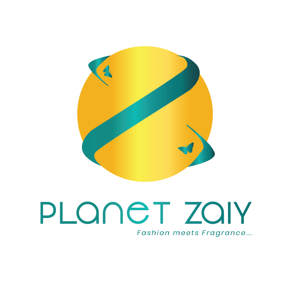
Planet Zaiy now officially has a logo! This is great news, in short, it is awesome, wholesome news. The whole process wasn’t easy, but it was definitely worth it. Your business logo is like the facial representation of your brand, and I am aware of its importance, so I had to ensure my logo represented my business in the light I see it through.
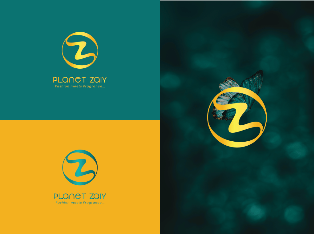
I had the name Planet Zaiy for my business in November 2018. Although I hadn’t started my business, I already had a name for it 😂 and with that, I knew for a certain I wanted butterflies in my logo. I love butterflies so much. They are some kind of angelic creatures to me, always showing up when I need reassurance about an idea or as a reminder to ease my mind. They are a fluttering representation that everything changes with time. From crawling caterpillars, they metamorphose into butterflies and for me that is a note that better days are coming. Aside that, who doesn’t love butterflies? They are really colorful and always perching on beautiful flowers.
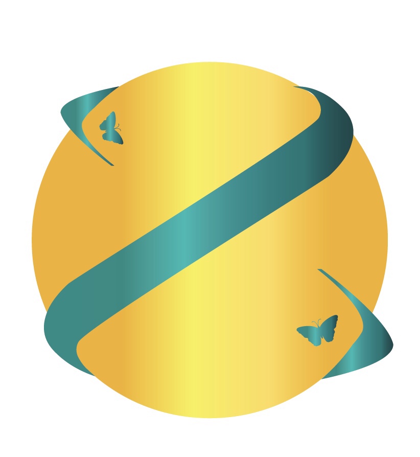
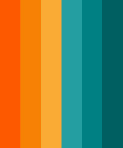
Back to present time, I paid my cousin to design a logo for Planet Zaiy. He is an incredible graphic designer and I had seen his works prior and I knew I’d want him to design my logo when I was ready. For my former temporary logo (100 Per Scent), my main colors were red and black— red because it is my favorite color. I wanted more sophisticated and classy colors for my new logo. One day, I was day dreaming about the interiors of my future shop and what I wanted it to look like, the colors teal and mustard looked fanciful on my couches, rugs, pillows and other interiors in my imagination. Then I thought, why not make my logo those two colors, that way everything looks so put together and nice when the shop arrives. Moreover, the colors are quite distinct and aesthetically pleasing for the brands image.
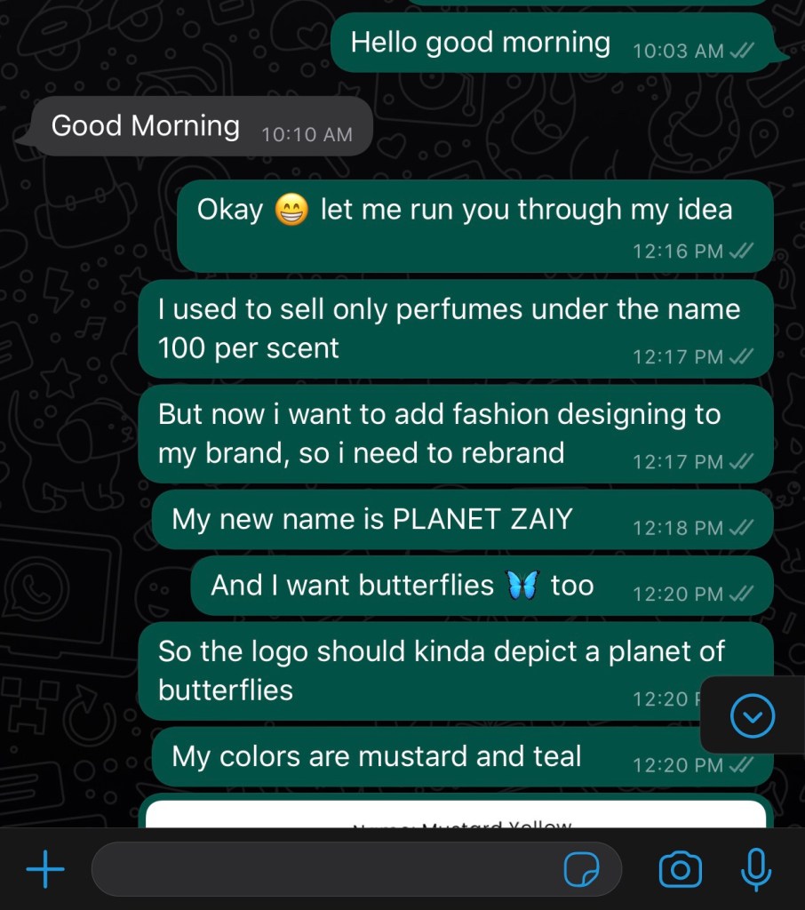
With my colors and my brand name, I messaged my cousin telling him I wanted a logo, explaining my idea. I told him my name and the concept I have of the logo signifying a planet of butterflies.
With these clear descriptions, he got to work. It took him a while, he is a student and he had school stuff to juggle and secondly according to him, he was experiencing creative blocks. Anyways, after about a month, he sent me about seven (7) different logos. Oh my God! I was so torn trying to decide what to pick and what to tweak. It was hell. After lots of insights, I made a decision to stick with two 😂, can you imagine? One brand, two logos! That’s how indecisive I was. I told him my two picks and showed him what to tweak and add.
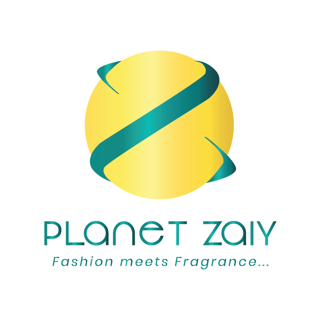
All the others he sent had butterflies except these two, but they were the ones I liked their designs better, so I told him I wanted butterflies in the first one. Also, the color was more yellow than mustard and I pointed that out. Some other slight changes were and finally I had logos I loved.
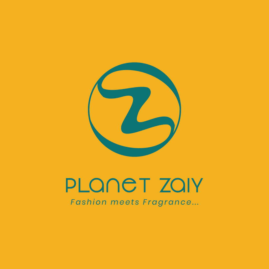
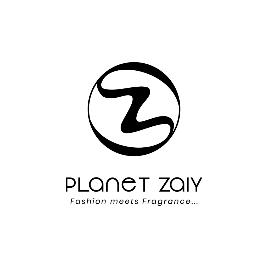
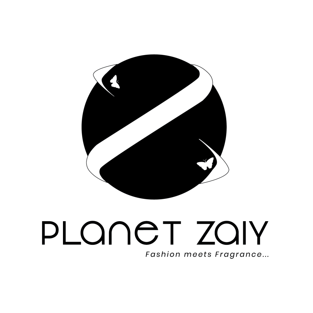
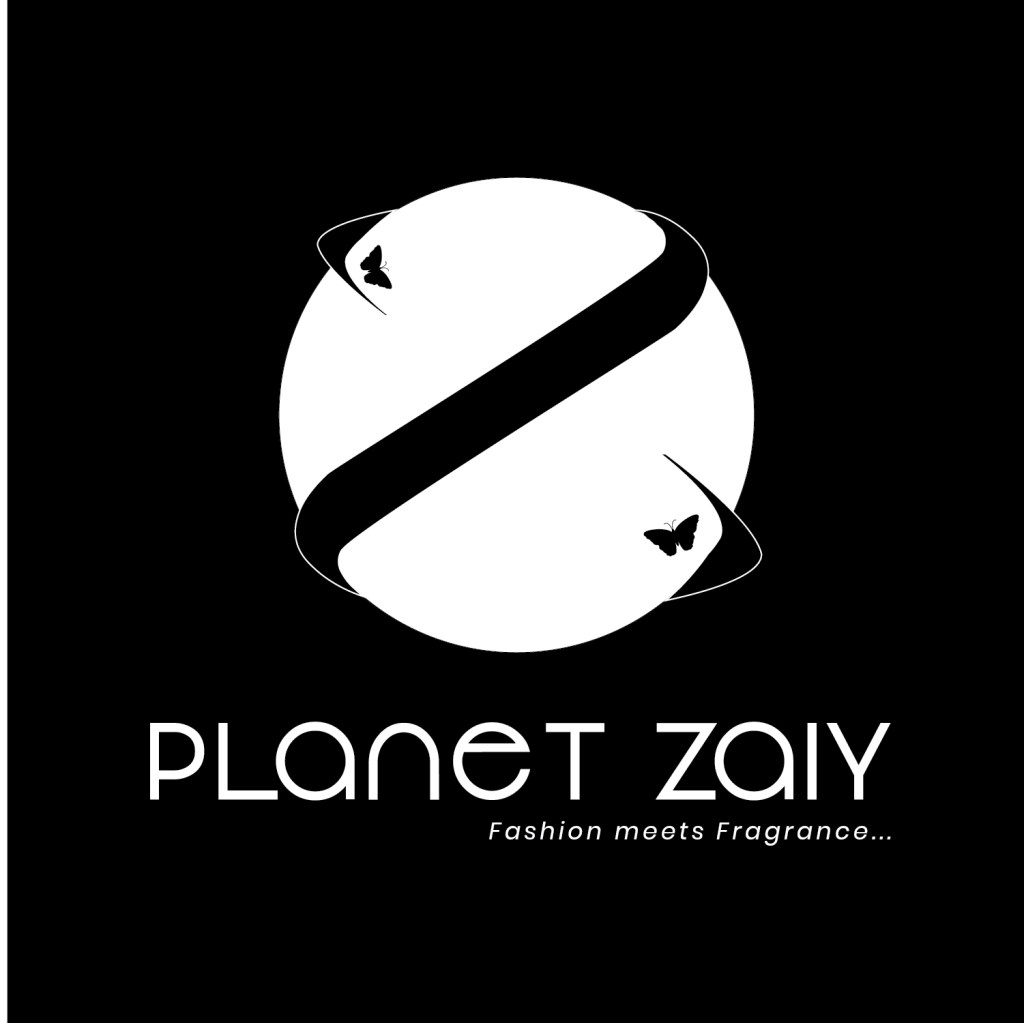
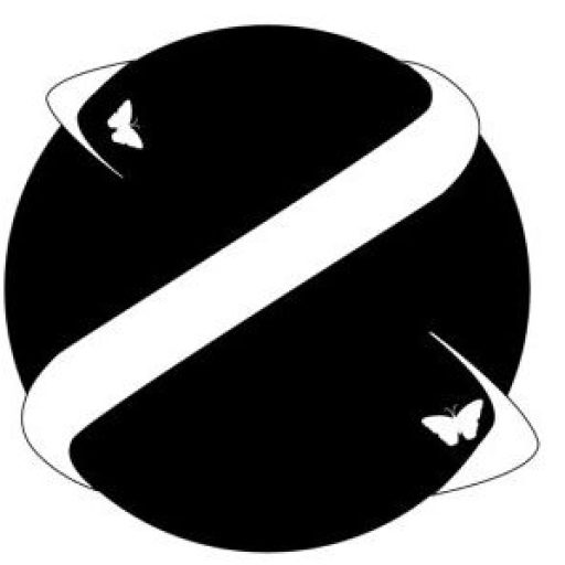
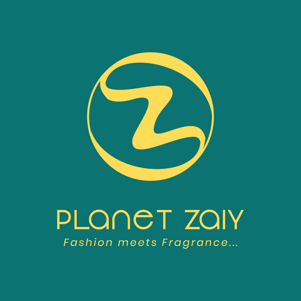
After seeing the corrections and sleeping on it overnight, I decided to use only the second logo below. Although I really love this one above and may still use it for some interfaces, I needed to make the tough decision of officially sticking to one as I am yet to meet a big brand with two logos and by extension two identities. I want my logo to be imprinted in people’s mind so anytime they see my logo mark or emblem anywhere, they can identify it and easily say “that is Planet Zaiy”.